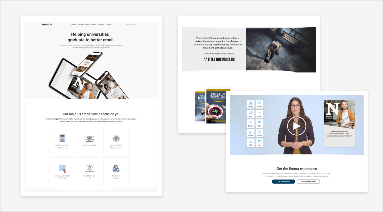
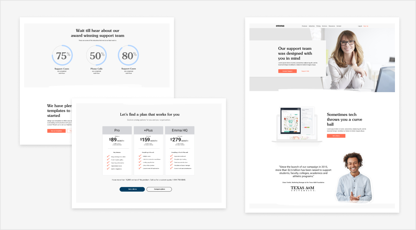
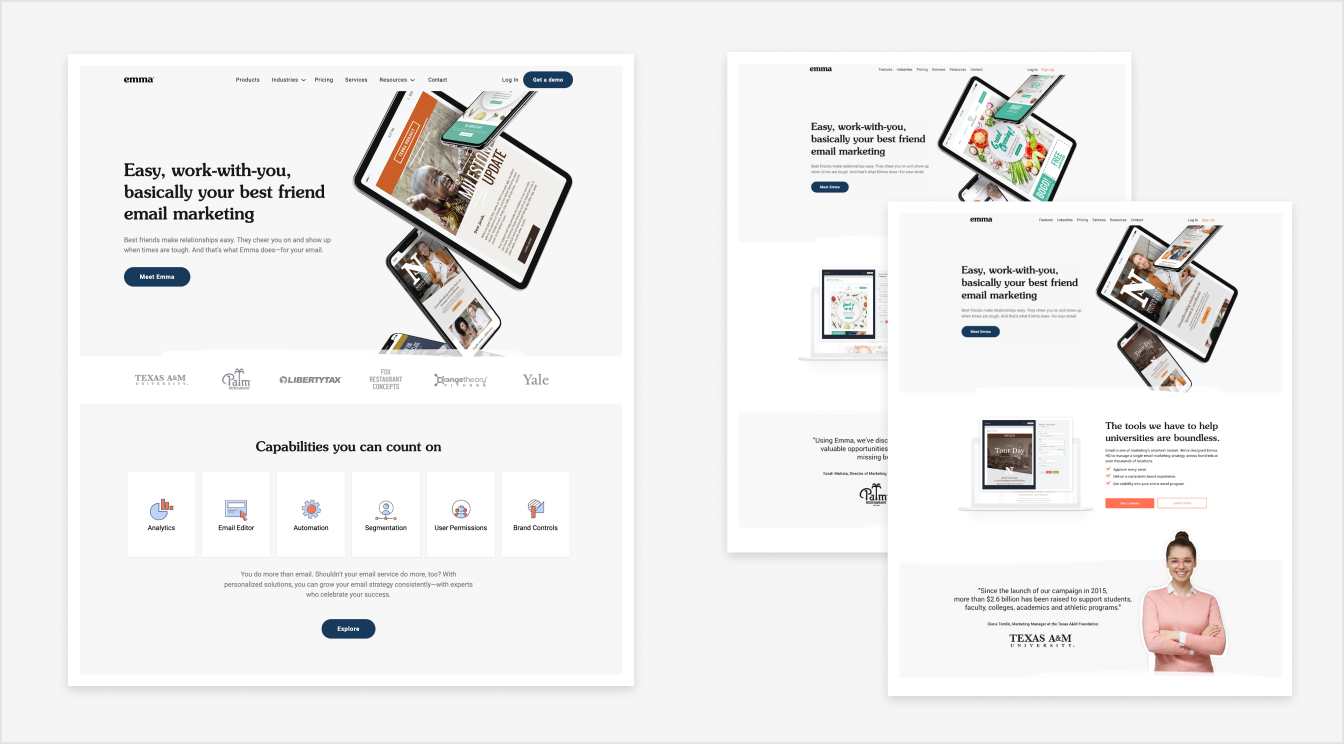
Menu
tylor loposser
  • Contact
  • Contact
Picture
Picture

Emma - Brand Refresh

A year after a rebrand we found illustration forward homepage was not work for our prospects and weren’t working our marketing team. So we decided to shift the focus towards beautifully designed emails. Unlike the rebrand this projected included feedback from users groups that led to our final design. This projected was fueled by data:

  • Adding character through a font family and the reduction of SEO keywords and marketing jargon. 
  • ​Using less ambiguous imagery that keyed our audience on exactly what we do
  • ​Created a modular design system to make additions and testing a lot easier. 
  • Increased color contrast to aid in accessibility. 
Picture